A well-designed presentation not only helps ensure that everyone can access and understand your content, but it also increases engagement and improves the overall learning experience.
Clear and Simple Layout: Use a simple layout design. Cluttered slides can be difficult to read and understand. Keep the number of items on each slide to a minimum. Arrange the content in a logical, intuitive order.
Readable Font: Use a sans-serif font such as Verdana or Arial for better readability on screen. The font size should be large enough to be easily read. For main points, 24-28 point font is a good rule of thumb. For subpoints, 18-22 point font is often sufficient.
High-Contrast Colors: Use high-contrast color combinations to ensure readability. For instance, dark text on a light background or vice versa. Be mindful of color blindness. Avoid using red and green together, as this is the most common form of color blindness.
Accessible Visual Elements: Always provide alternative text descriptions for images, charts, and graphs. This will allow screen reader software to describe these elements to visually impaired users. Avoid using color as the only method of conveying information.
Simple and Relevant Graphics: Use clear, simple graphics and avoid overly complex diagrams. Be sure graphics are relevant to the content, and not just decorative.
Clear Navigation: Ensure slides are numbered, and a table of contents or an agenda slide is provided, if possible. Include clear transitions between slides to guide the viewer through the presentation.
Closed Captioning: If your presentation includes videos, ensure they have closed captioning for those who are hearing impaired.
Consistency: Keep styles, fonts, and colors consistent throughout the presentation to avoid confusion.
Language Simplicity: Use plain language and avoid jargon or complex terminology when possible. This is especially important for an audience that may include caregivers and social workers who might not be familiar with certain technical terms.
Test Your Presentation: Run your presentation through PowerPoint’s accessibility checker. This tool will help identify potential accessibility issues that need to be fixed.
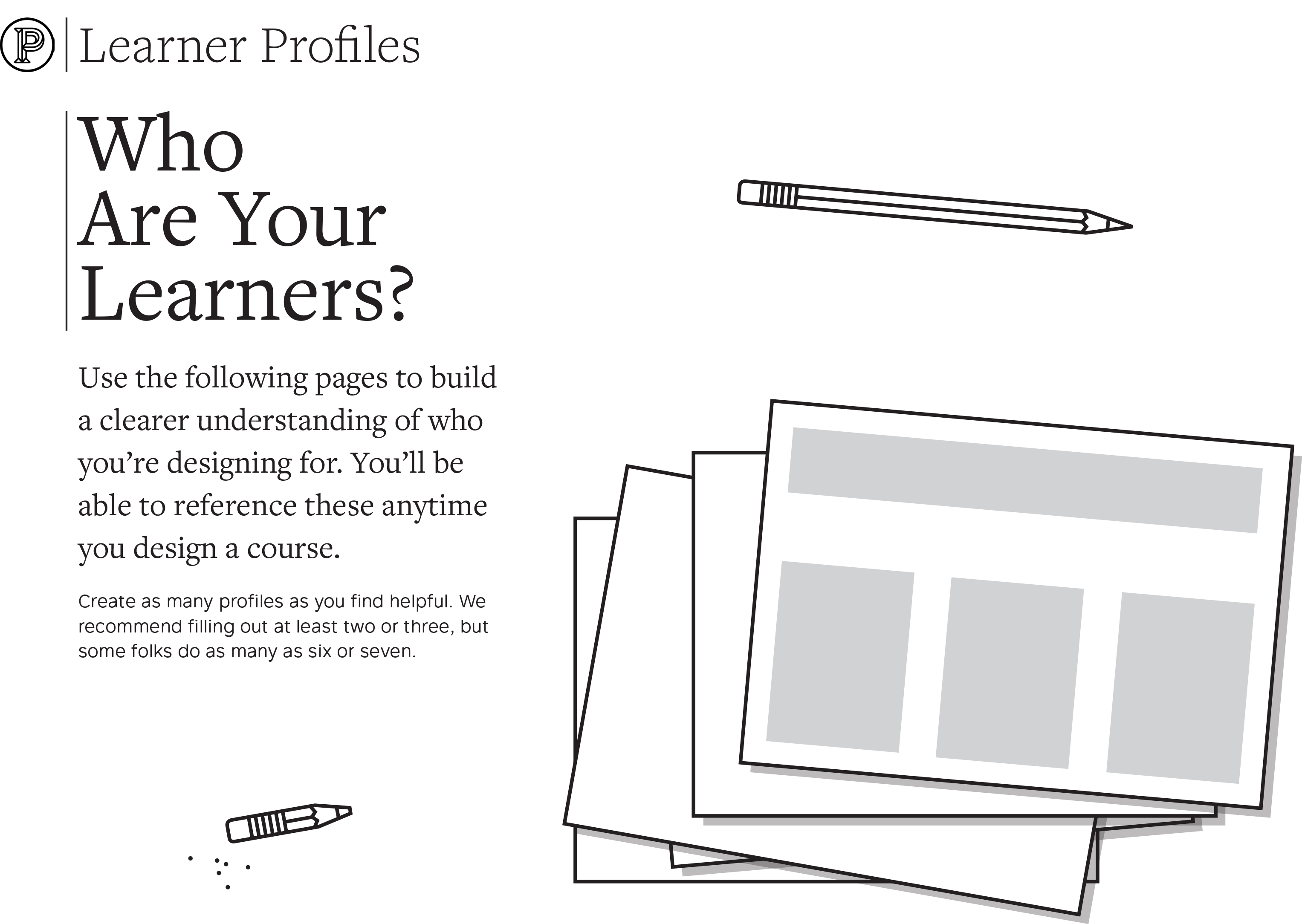
Learner Profiles
Learner profiles are used to build a clearer understanding of who the learner we’re designing for is.
You’ll be able to reference these anytime you design a course or deck. This is a great exercise to help anchor accessible design.
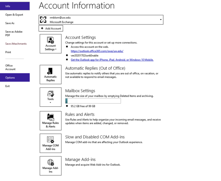
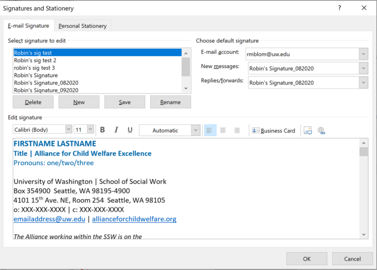
Here are the steps to changing your email signature:
From the Outlook desktop home page, go to File at the top, then in the left-hand menu click Options
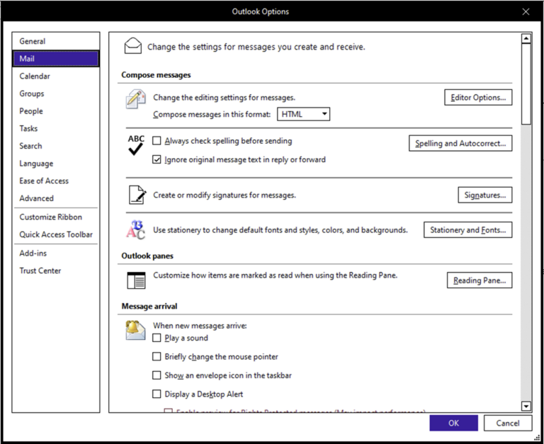
In the next window, in the left-hand menu, click Mail, then find Signatures in the right pane.
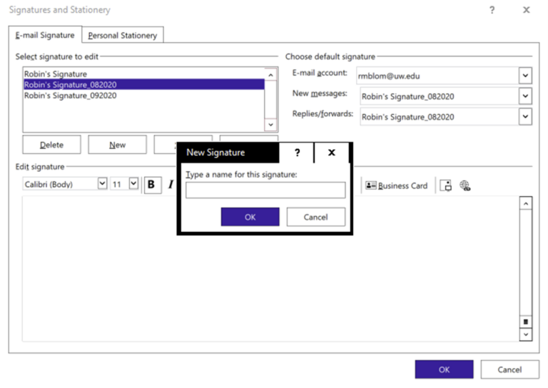
Click the “new” button and name this new signature. (This step required to do Step 5.)
Create the new signature from the brand standards guide in the main window at the bottom half of the window, like pictured below.
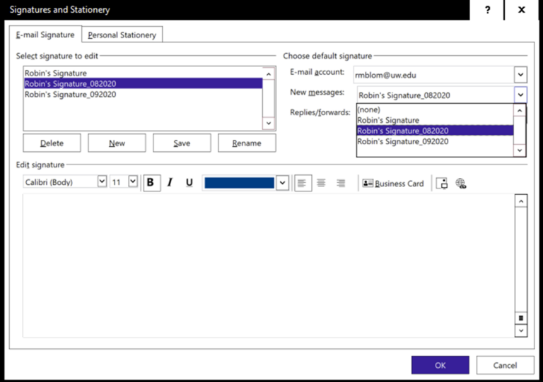
When finished, above the main window on the right, click on the New messages drop down and choose this signature (whatever you named it). You may also do the same with the replies/forwards dropdown, or you can use an edited/shortened signature for those.
Click OK at the bottom.
To test, create a new email in Outlook and see if it’s there.
You’re done!
PowerPoint Style Guide
To download the PowerPoint template, visit the Templates page.
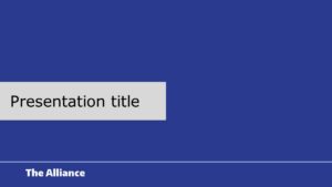
Logo opening slide
Use this slide at the beginning of every presentation. It can be left on the screen until your presentation begins.
Presentation title slides
There are three options for this slide. Use whichever you feel fits the look and content of your presentation.
Tribal land acknowledgement
This slide has a recommended land acknowledgement on it, but feel free to adjust the language.
Learning objectives
Include this slide at the beginning of training presentations.
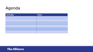
Agenda
There are two options for this slide. Use whichever best fits the format of your content.
Text only, 1 column
This simple slide is used for words-only content.
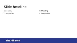
Text only, 2 column
This slide can be helpful for showing comparisons or lists.
Full bleed graphic, white or blue
This slide is an option for things like quotes, quick points or facts.
One graphic
This slide can be used for illustrating a point with a single large graphic.
Two graphics
Showcase two graphics side-by-side. The two do not have to be the same size.
Section break
Use this type of slide for breaking up sections within a presentation.
Video slide
Insert the video into the slide make it the full height and width. This is the only slide where there is no branded bottom bar.